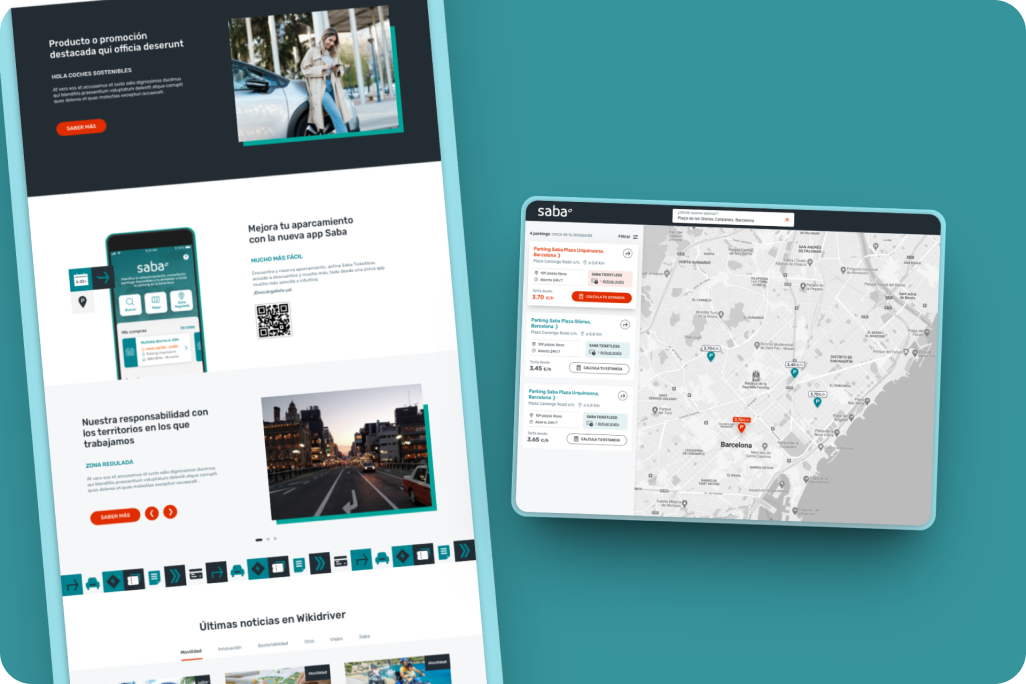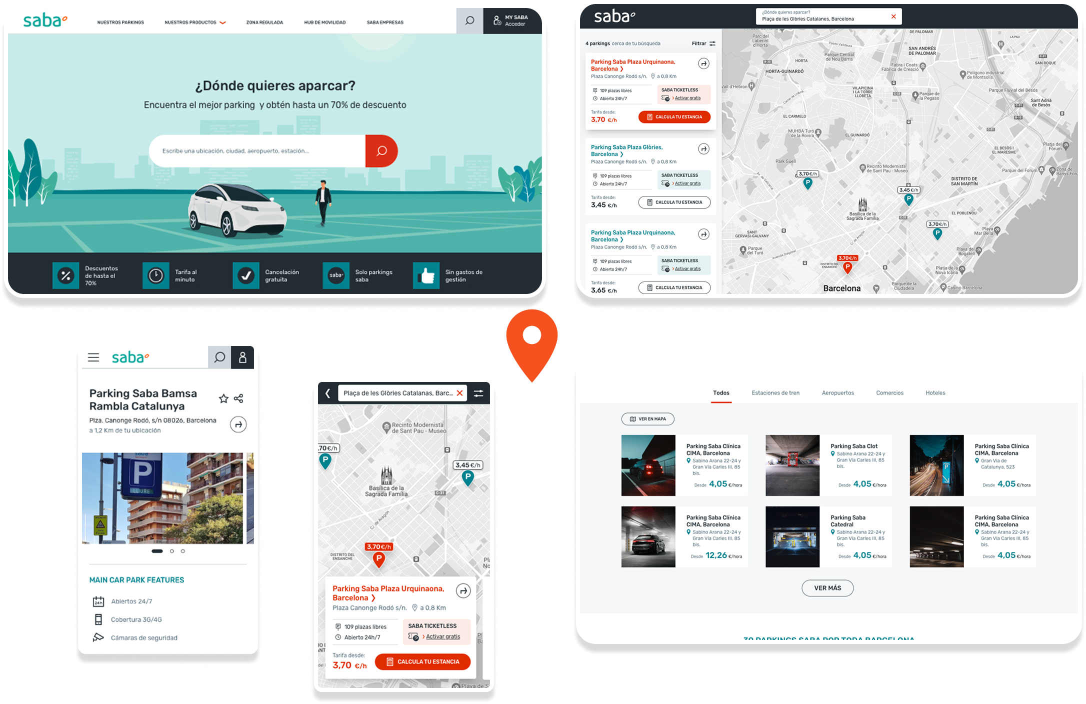
A web app that helps users easily find and book car parkings, while also exploring and purchasing parking products tailored to their needs. Designed to improve the product discovery and buying experience, it includes smart recommendations based on stay duration and location.
Product Designer
8 months


Saba is a leading urban mobility company specializing in parking management across Spain and other European and Latin American countries. Focused on innovation and accessibility, Saba offers digital solutions like online booking and EV support to create smarter, user-centered city experiences.
Saba identified the need to redesign their website after data revealed low conversions. They needed a more intuitive parking search and clearer user flows, while working within a limited budget and ensuring compatibility with their existing, technically constrained platform.
After reviewing the platform and user flows, I identified three main issues impacting the experience:
To improve the overall experience, a new website was designed with the following key changes:
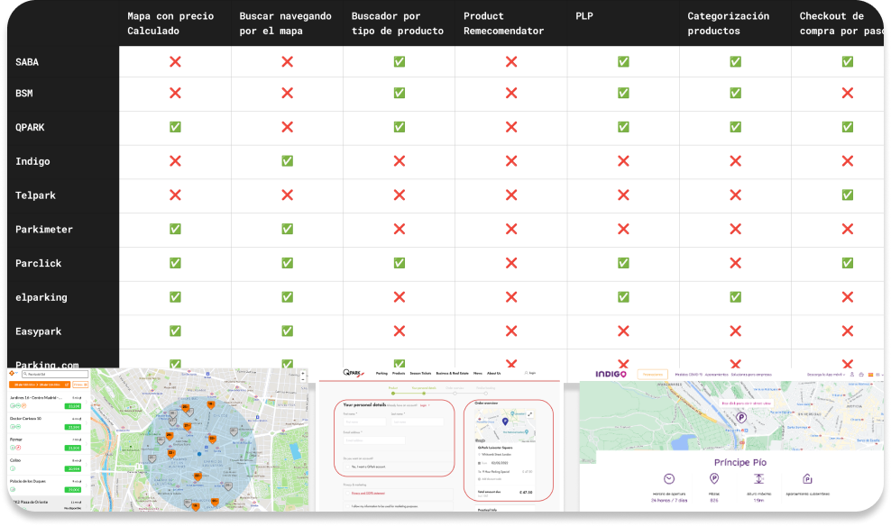
As part of my research, I analyzed 10 direct competitors, both national and
international, to
better understand how other companies structure their digital experience.
I looked into their parking search tools, product categorization, checkout flows,
and
whether they guided users through product selection. I noticed that most
competitors focused
mainly on showing hourly prices, with little to no effort in explaining product types or
their benefits. None of them had a product recommender, their map searches were
static, and
very few offered detailed product pages.
These gaps helped me identify clear opportunities for Saba to offer a more user-friendly and
differentiated experience.
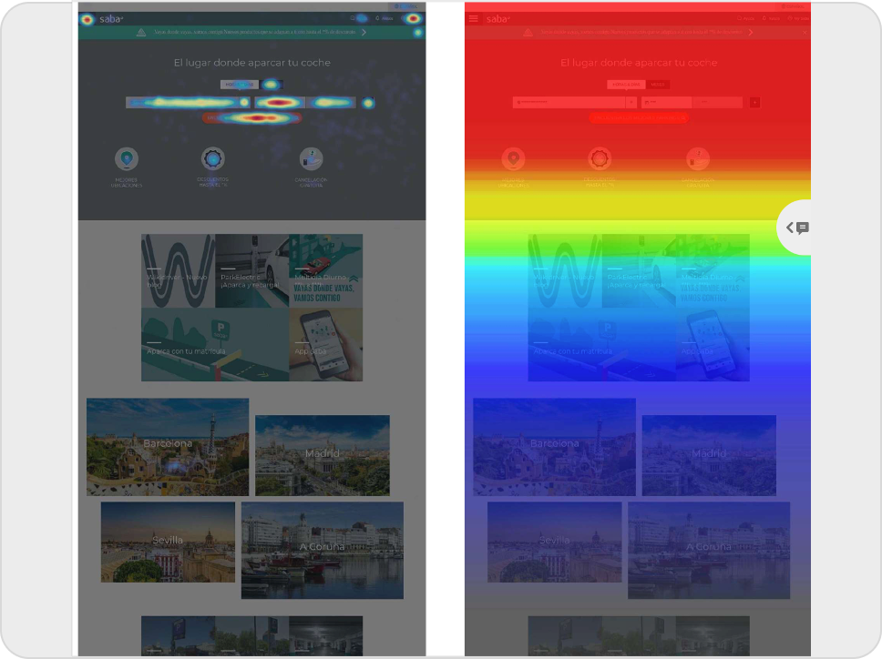
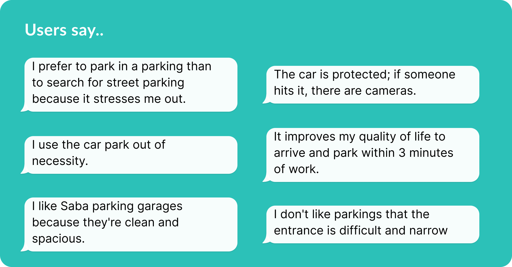
I worked closely with a UX researcher to better understand how users interact with Saba’s services. We interviewed occasional, regular, and frequent users to learn about their habits and pain points when using the parking platform. We also reviewed web store feedback and used Hotjar to observe real user behavior. These insights helped us spot key areas for improvement and guided design decisions that made the experience smoother and more useful.
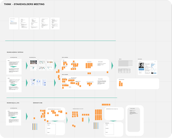
During the Research and Empathize phase, we conducted intensive workshops with
various
stakeholders, including IT, Marketing, Sales, and SEO teams. The primary goal
was to
thoroughly understand their needs, concerns, and aspirations, while also identifying
potential limitations and constraint
This collaborative approach was crucial in shaping a solution that not only met their
diverse requirements but also aligned with their broader objectives. Our aim was to ensure
the final product was the best possible solution for all involved.
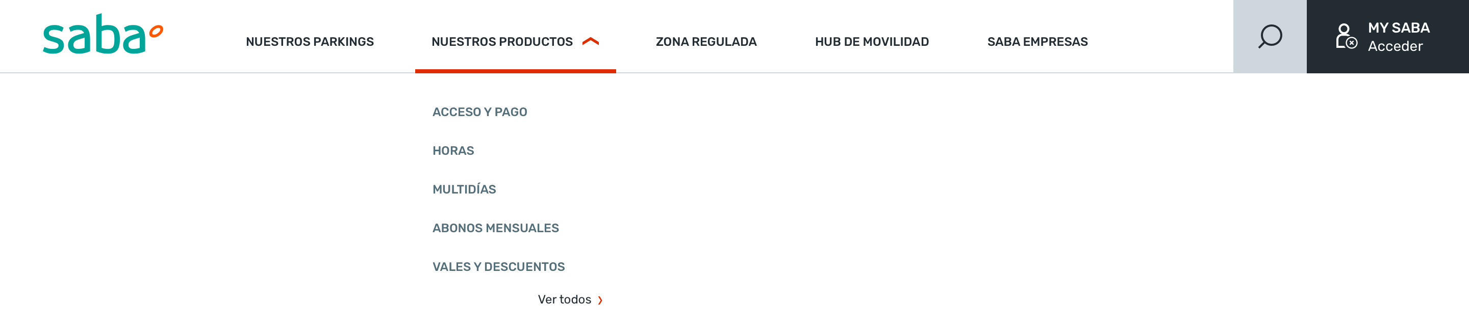
We reorganized the website by keeping only the most useful pages, creating a cleaner and more intuitive navigation. The menu was simplified to focus on the most visited and important pages, improving the overall user experience.
Based on the lessons learned, we have designed an improved Main Navigation, with the following strategic insights:
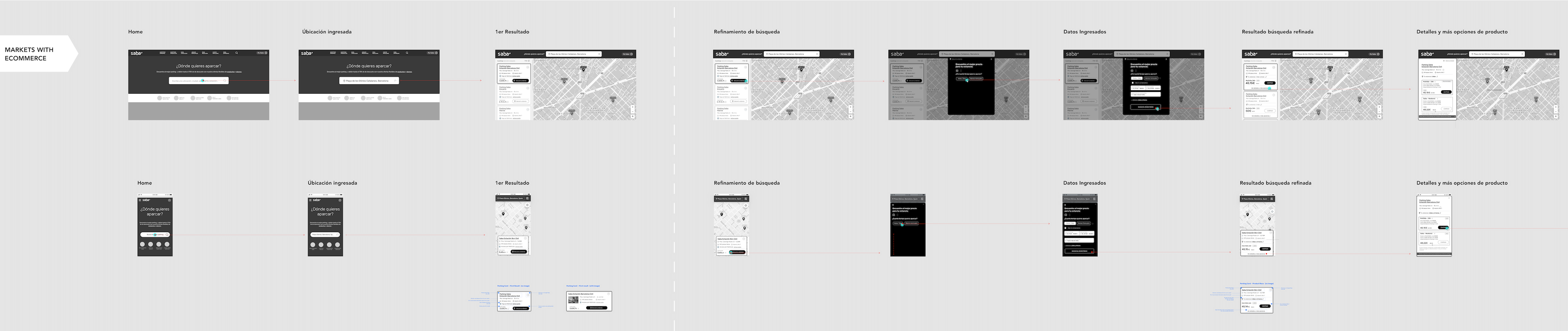
I created low-fidelity wireframes to define the overall layout and key functionalities of Saba Web. These were presented to various stakeholders from the client side to ensure alignment with business objectives and gather early feedback. One of the main challenges was designing the parking search functionality, which led us to conduct specific user tests to validate and refine this feature. After several rounds of iteration, incorporating both stakeholder input and user insights, I refined the wireframes into high-fidelity designs.
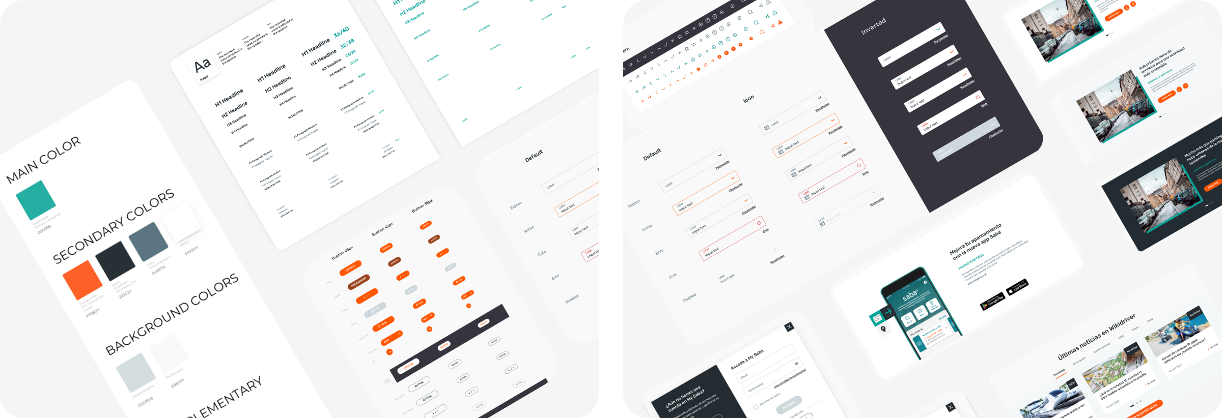
I created a style guide and design system based on SABA’s corporate identity, ensuring a simple and cohesive visual language aligned with their brandbook. I defined core UI components, interactive states, and specifications support developers and maintain consistency across the product.
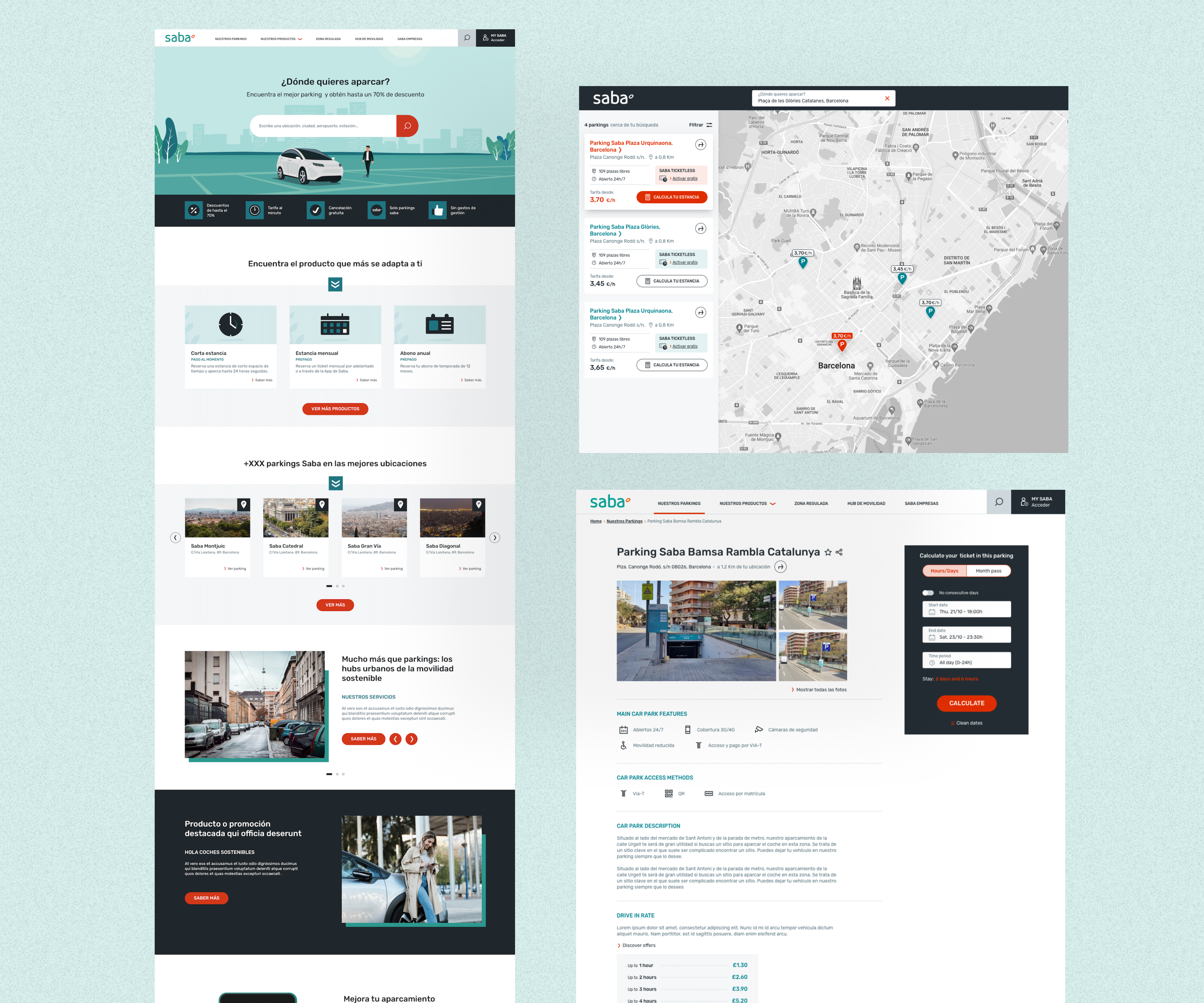
After defining the wireframes, conducting user tests, mapping user flows, and creating the style guide, I translated everything into high-fidelity screens. The design focused on clean layouts, minimal UI, and a modern, consistent visual style aligned with the brand.
At the end of each sprint, we delivered the corresponding screens to the
developers, along
with a comprehensive Figma file containing all documentation: user flows,
components,
states, and use cases. At the client’s request, we also prepared an
additional document
outlining the specific functionality of each screen.
After delivery, we collaborated closely with the development team, conducting QA sessions to
ensure the final implementation matched the designed experience.
The project is currently live with Phase 1, which includes the main user
flows: parking
search, parking detail page, checkout, and product management. The client decided to split
the development into phases due to budget constraints.