Website redesign for Implika focused on SEO and CRO strategies to increase user engagement and conversions while maintaining brand consistency.
Product Designer
10 months


Implika is a leading education and professional training company in Spain, offering a wide variety of courses both online and in-person. With a strong presence in the digital space, Implika helps individuals develop skills and gain certifications to advance their careers across multiple industries.
Redesign their website in order to improve user experience, optimize their SEO and increase conversion rates, while strictly maintaining their corporate branding guidelines. The project required full collaboration with their in-house SEO analysts to ensure that every design decision aligned with their organic positioning strategy.
We faced a confusing site structure that harmed both usability and conversions. Main issues:
We simplified the structure and focused on SEO and CRO to guide users effectively.
We studied several key Spanish competitors in the education sector to identify industry
patterns and positioning strategies.
Key findings:

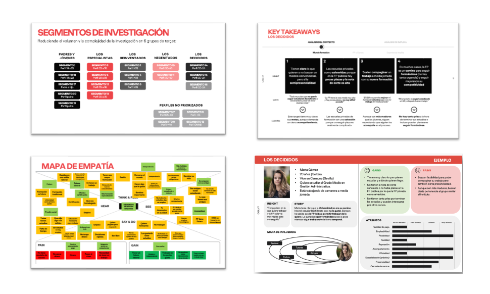
We interviewed several current and former Implika students to uncover key
motivations and pain
points.
Based on internal database analysis, we defined six user profiles and developed six
personas to
guide the design process. These profiles also helped simplify the research and supported
targeted communication, message segmentation and the tone of voice we aimed to reflect on
the
website, clear, trustworthy, and oriented toward real professional outcomes.
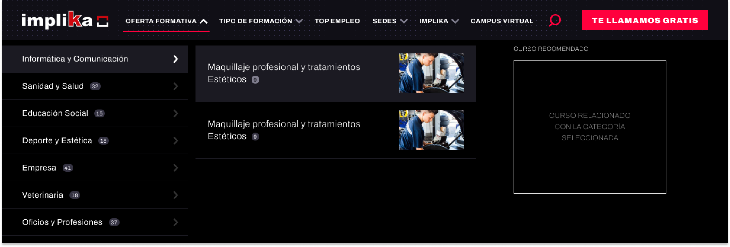
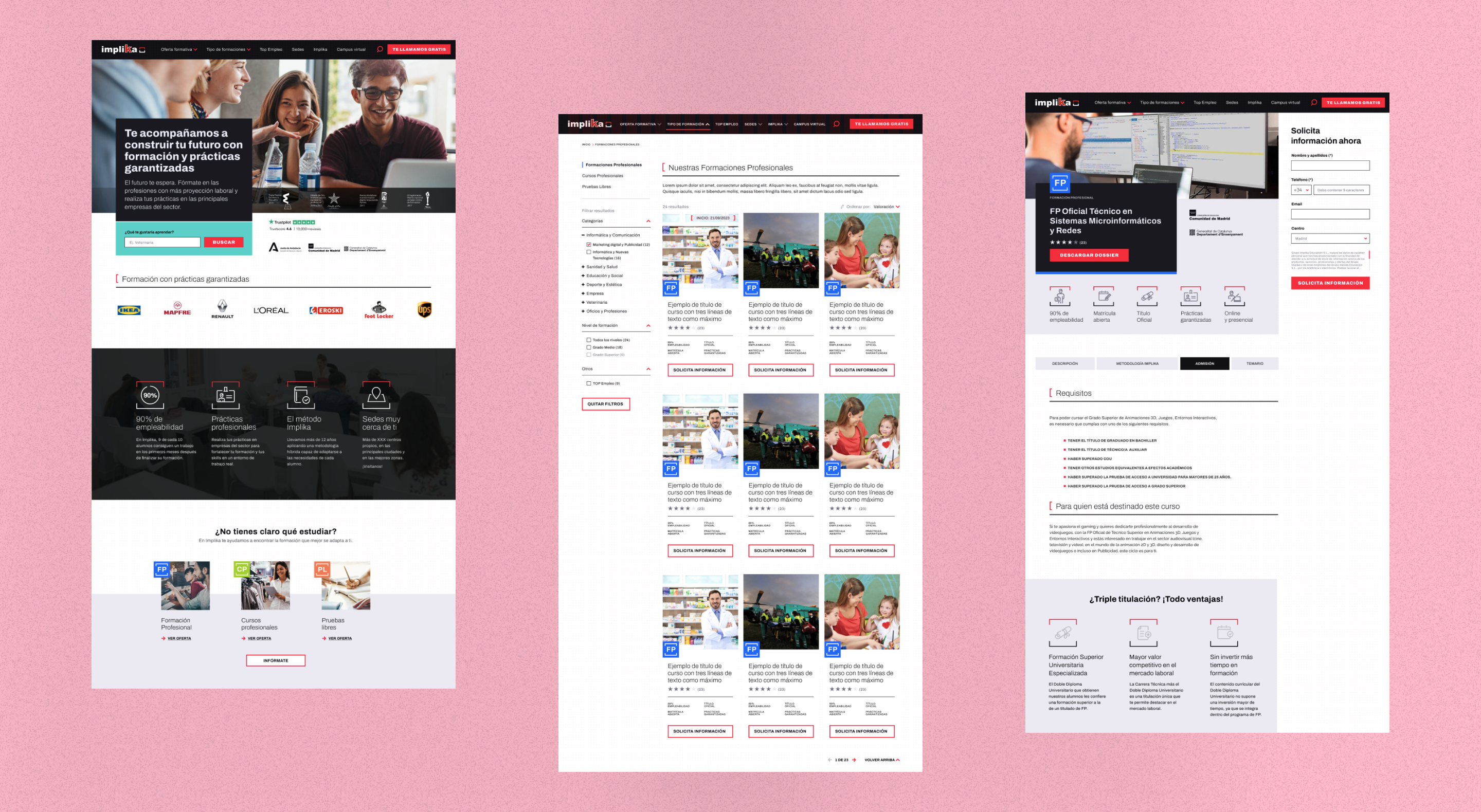
We collaborated closely with the SEO department, who helped us identify the pages with the highest traffic. We also worked with Marketing to understand which pages they wanted to promote. Based on this, we reorganized the website by keeping only the most useful pages, creating a cleaner, more intuitive navigation. The menu was simplified to focus on the most visited and important pages, enhancing the overall user experience.
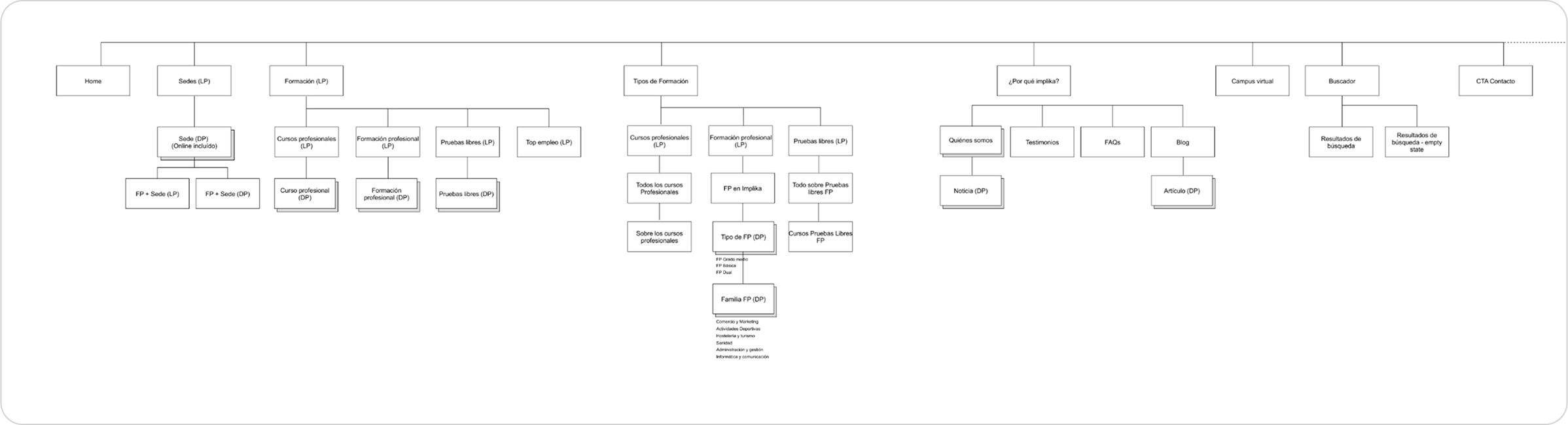
Based on the lessons learned, we have designed an improved Main Navigation, with the following strategic insights:
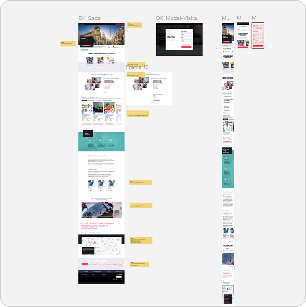
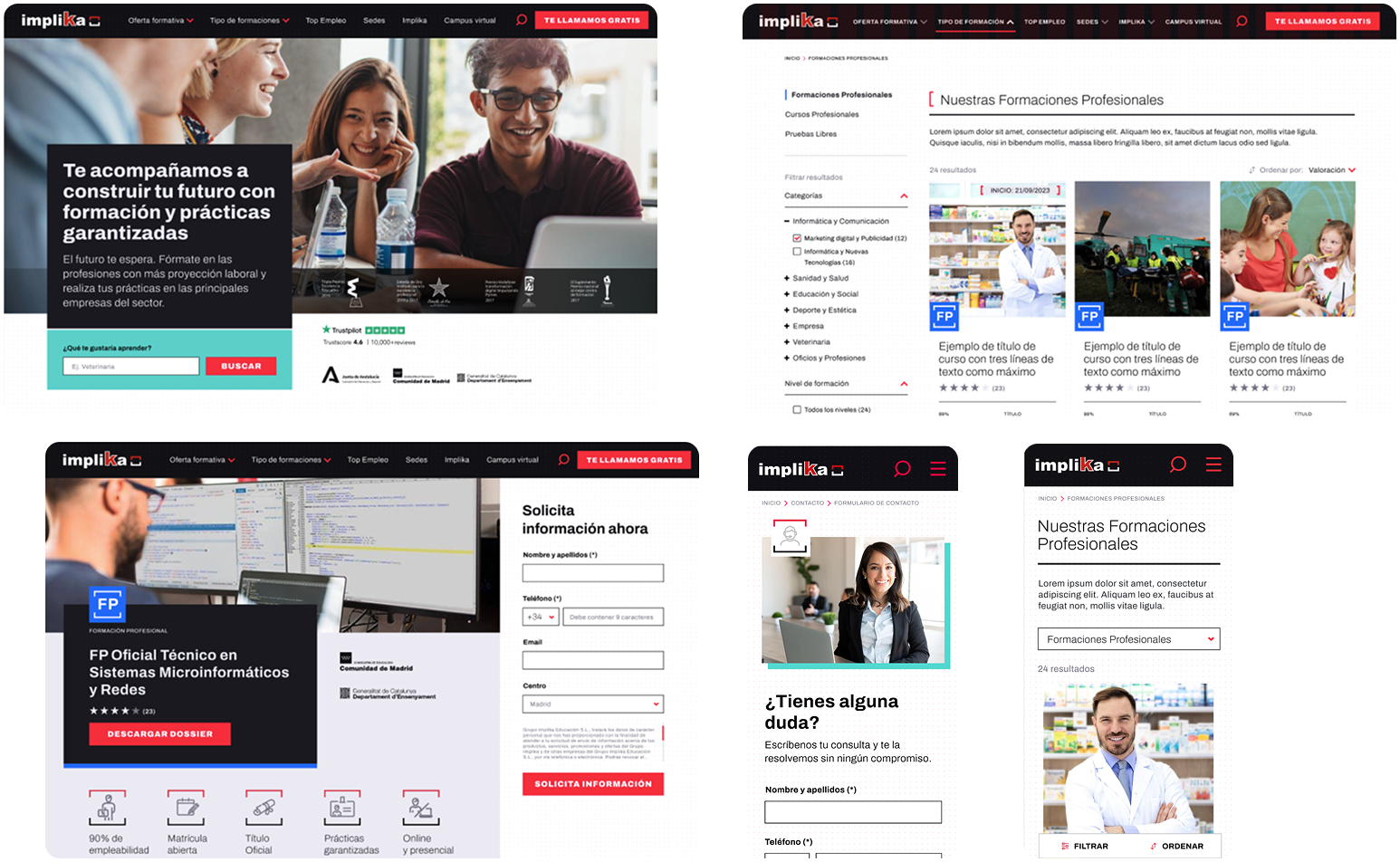
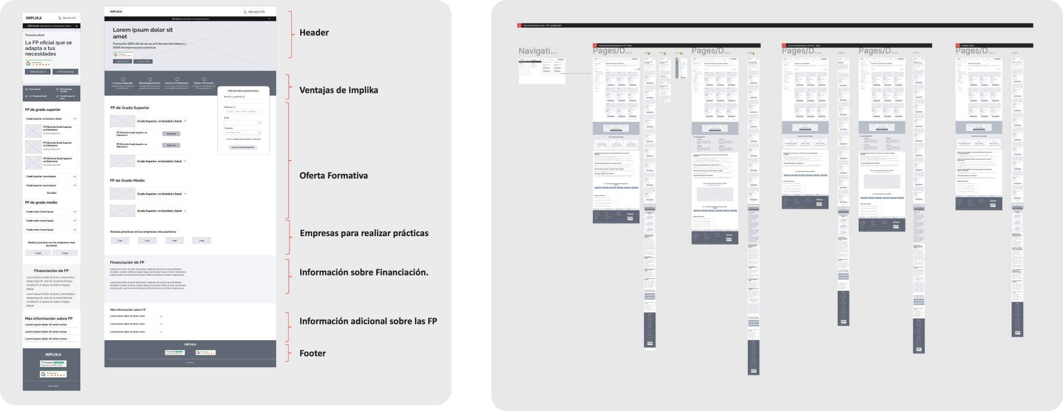
I created low-fidelity wireframes to define the overall layout and key functionalities of Implika Web. These were presented to various stakeholders from the client side to ensure alignment with business objectives and gather early feedback.
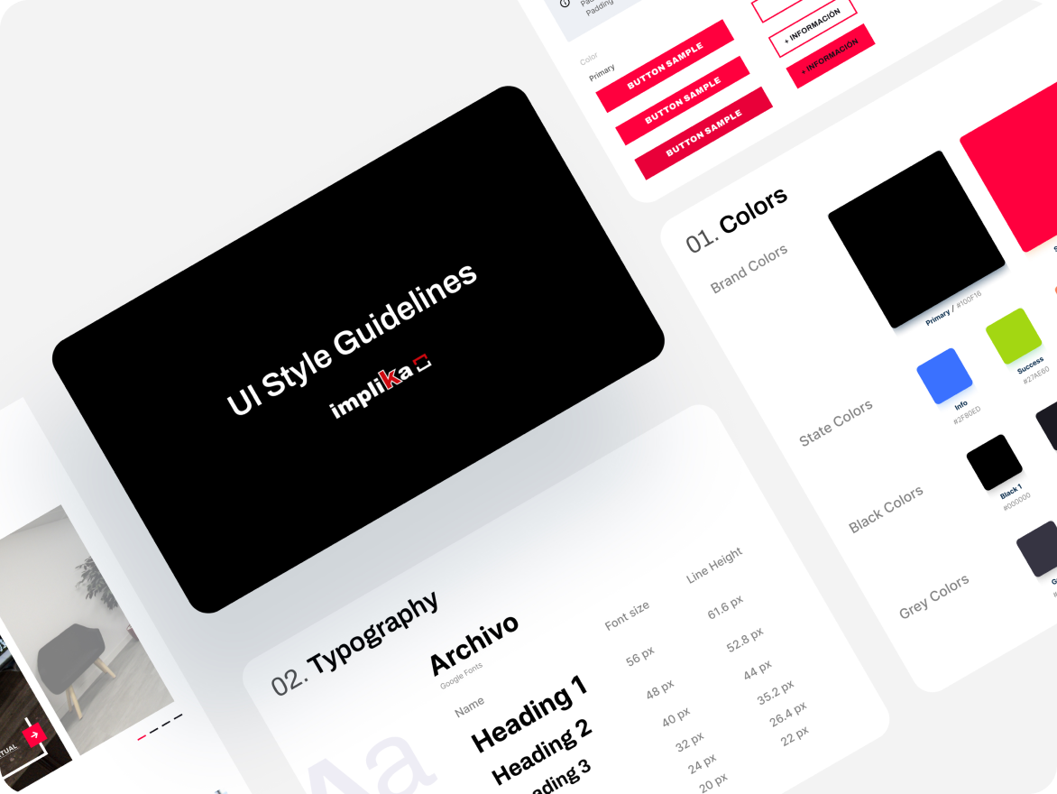
I created a style guide and design system based on Implika’s corporate identity, ensuring a simple and cohesive visual language aligned with their brandbook. I defined core UI components, interactive states, and specifications support developers and maintain consistency across the product.
After defining the wireframes, conducting user tests, mapping user flows, and creating the style guide, I translated everything into high-fidelity screens. The design focused on clean layouts, minimal UI, and a modern, consistent visual style aligned with the brand.
At the end of each sprint, we delivered the corresponding screens to the developers, along with a comprehensive Figma file containing all documentation: user flows, components, states, and use cases. At the client’s request, we also prepared an additional document outlining the specific functionality of each screen.